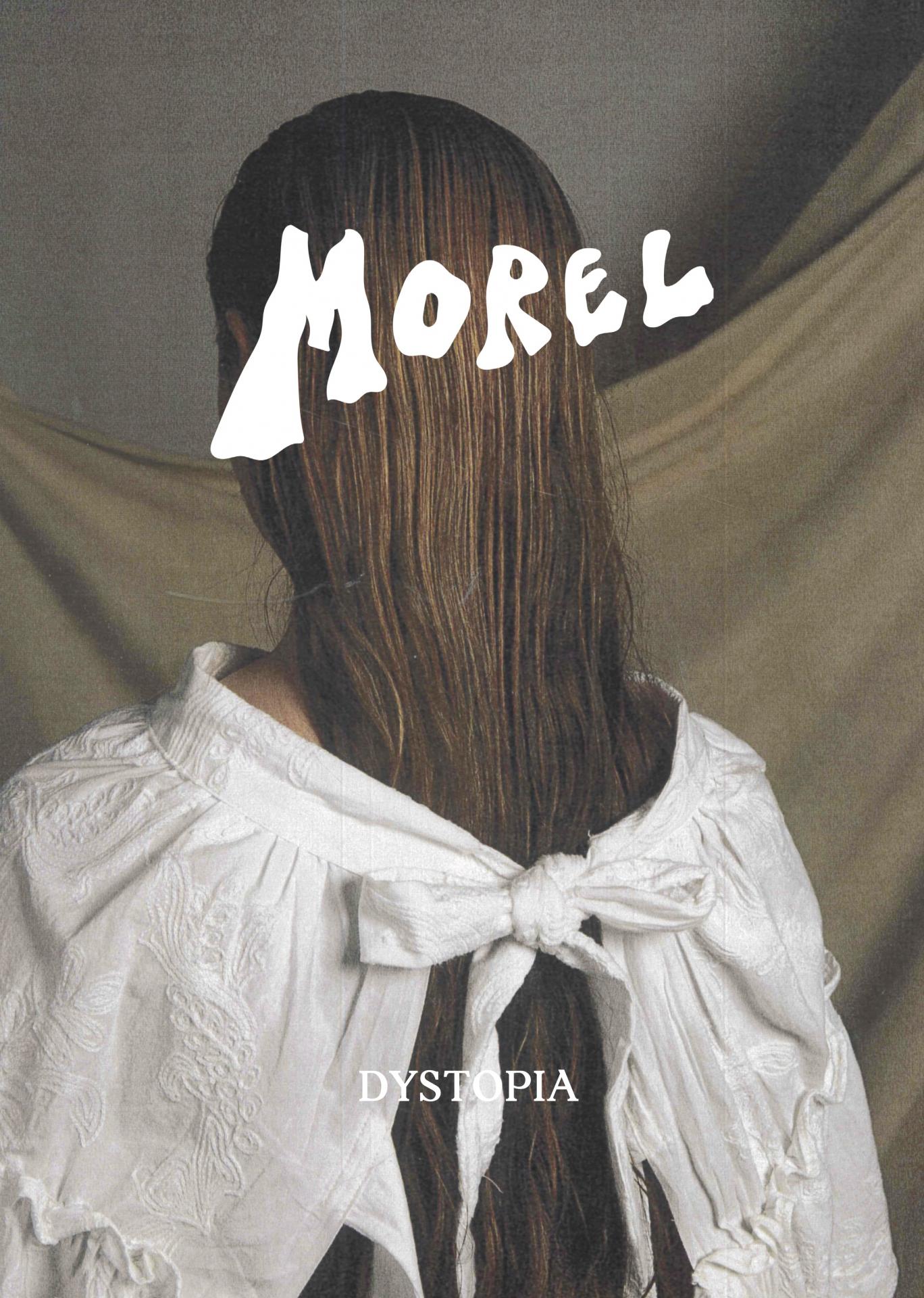
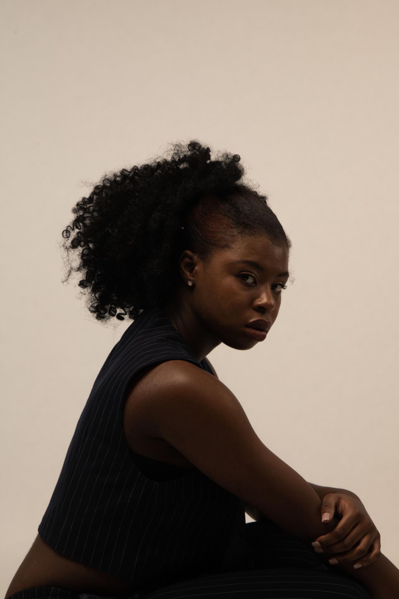
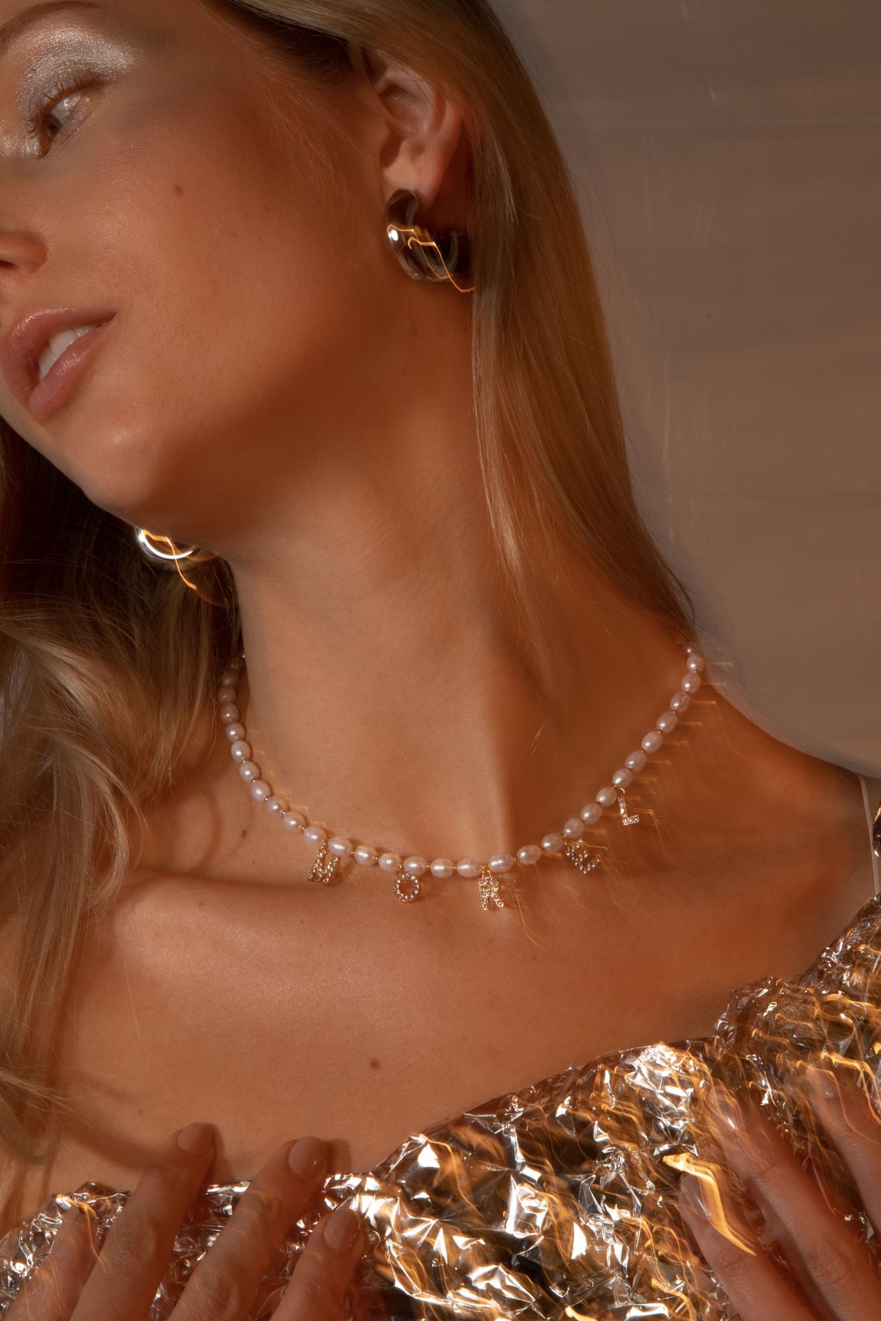
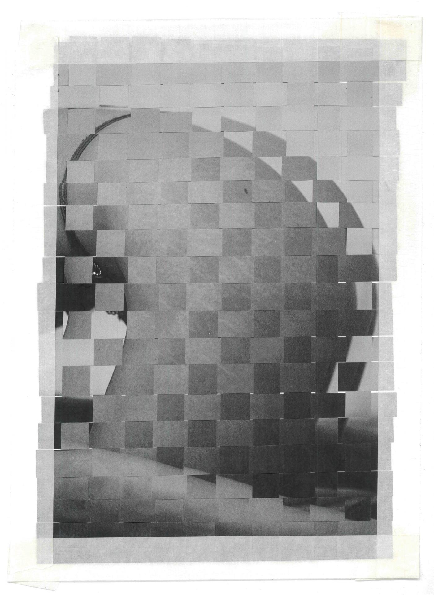
Having always been a lover of print magazines and building up a collection up over the years, it felt natural for me to create a magazine of my own for my university final project. Taking the overall role of art director, this project has allowed me to build on my skills in photography, styling, writing and graphic design. Despite my interests in fashion, I believe in the importance of prioritising the planet, and wanted to use this project as a way of encouraging conversation and change around fashion and sustainability, so that the fashion industry might one day be seen less as a destructive factor and more of a positive one.
Inspired by the mushroom of the same name, my project is titled ‘Morel’, and seeks to be a critical mouthpiece on wider social, cultural and environmental issues through the lens of fashion and lifestyle. Morel is a multi-channel publication that explores the central theme of ‘dystopia’ and how this can be expressed visually within a contemporary context. Instead of imagining Blade Runner or Black Mirror, I wanted to create a publication that was soft and beautiful to look at and could provide a form of escapism while still focusing on these very topical and often bleak issues. With a combination of curated imagery, layout design and thought-provoking written pieces, I intend to suggest that instead of dystopia being an event far off in the future, it is more subtle and happening now. Through this message I hope to reach more young people that currently sit outside of the community of activism and inspire positive change. As the mushroom symbolises transformation, the project’s title is a metaphor for its shapeshifting form and the transformations I hope to see in the future.
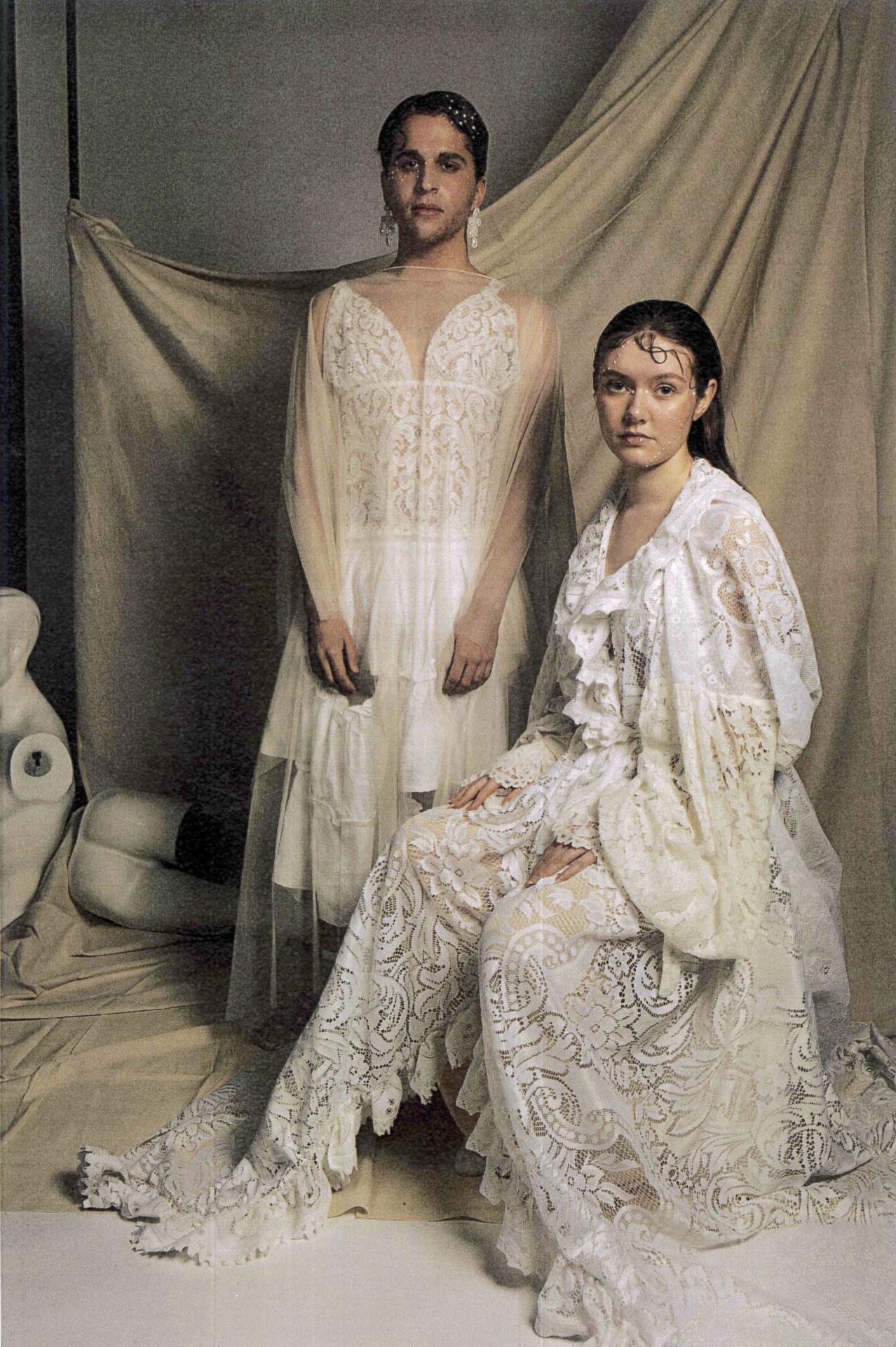
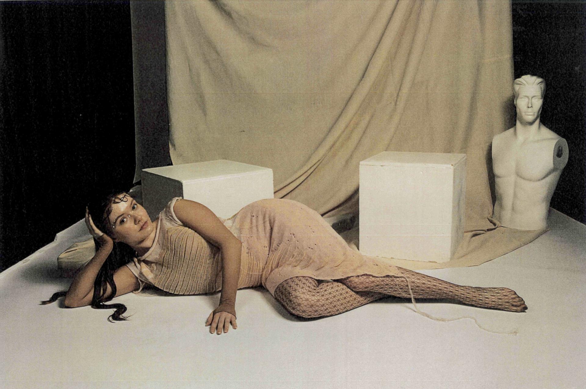
The publication’s visual identity is inspired heavily by juxtapositions and is made up of conceptual and process-based opposites such as nostalgia and the future, nature and technology, and analogue and digital image-making methods. Morel champions the often archaic image-making methods that have given the print magazine its signature grainy look. All images have either been shot on 35mm film, or digitally with additional printing and re-scanning to achieve a tactile and nostalgic feel. This contrasts with the digital elements in other areas of the project such as the shiny 3D logo featured on the website, which contrasts again with the grainy and pixelated effect produced by the 2000’s video camera used to create the video playing in the website’s background.
Morel currently consists of a printed magazine, a website, Instagram account (www.morelmagazine.com / @morelmagazine), and is an ongoing project where I hope to collaborate with others for future issues.

