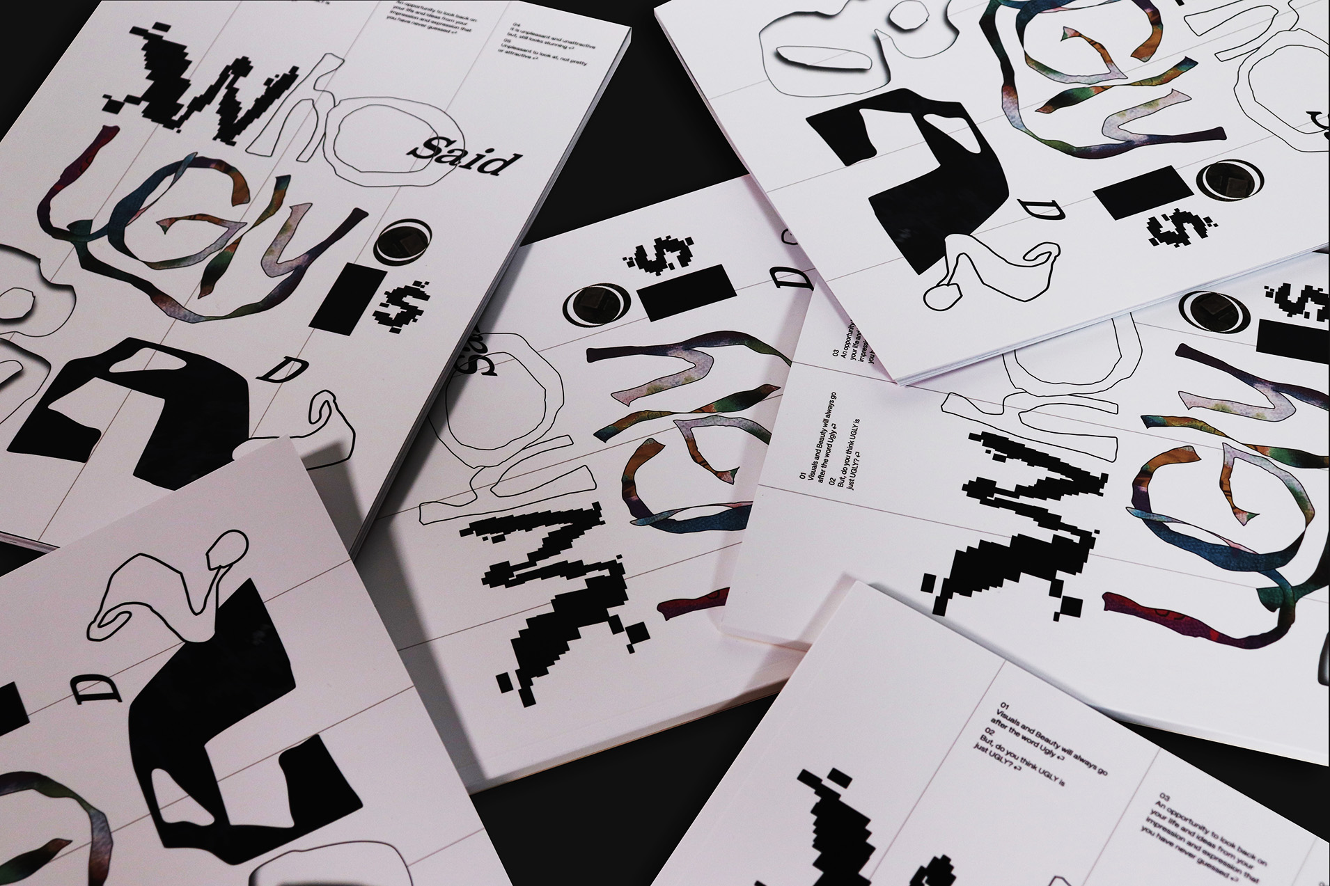
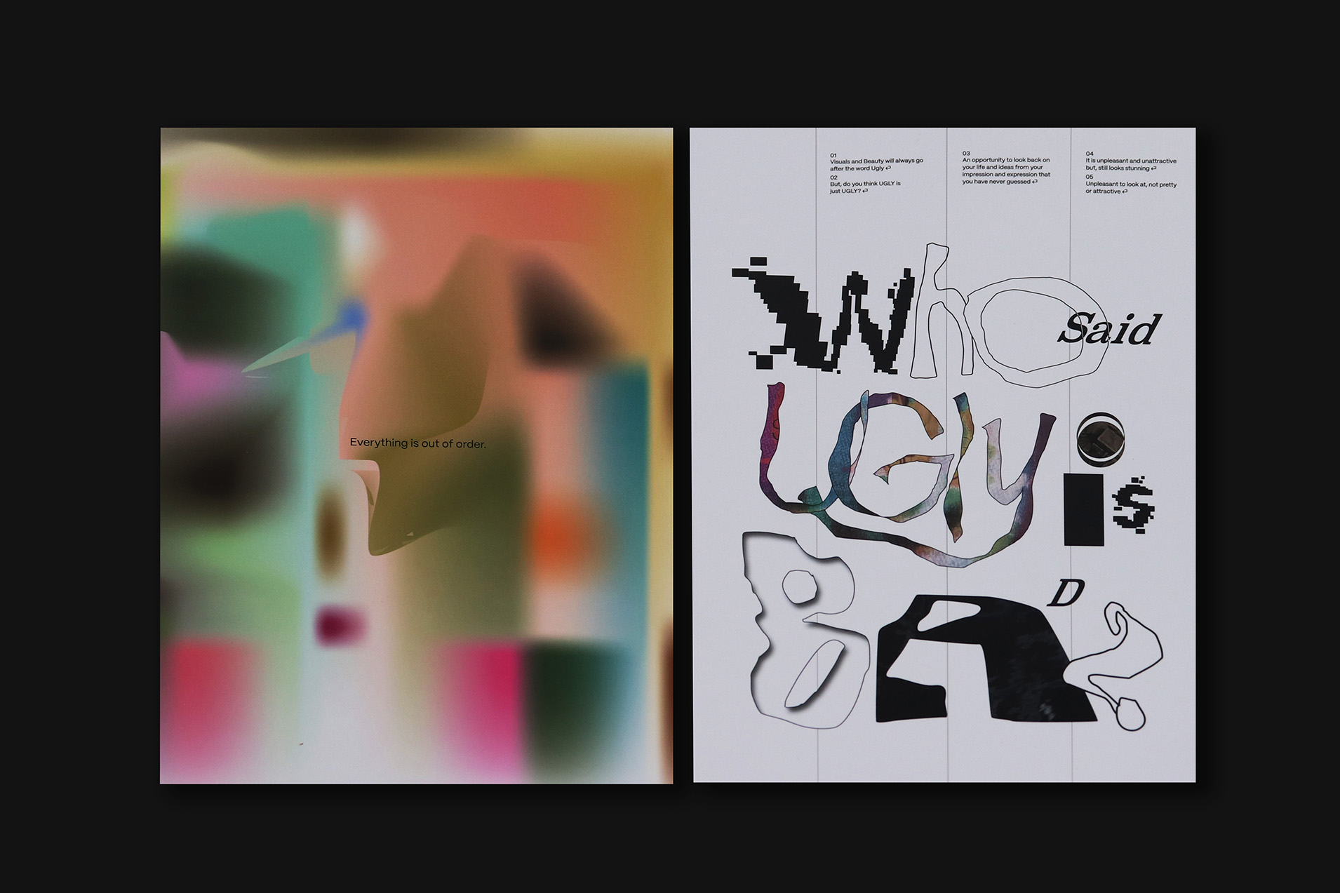
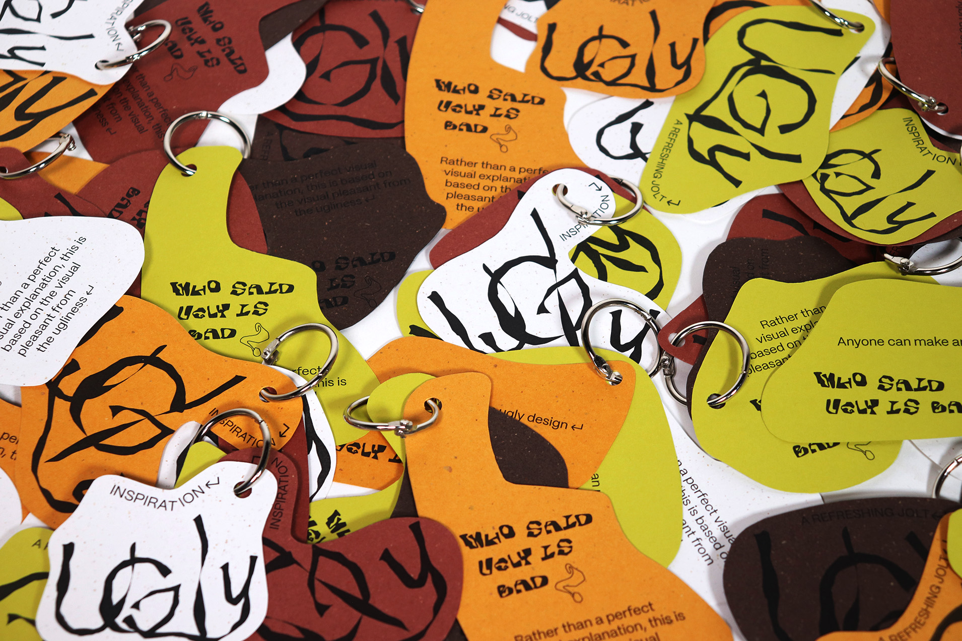
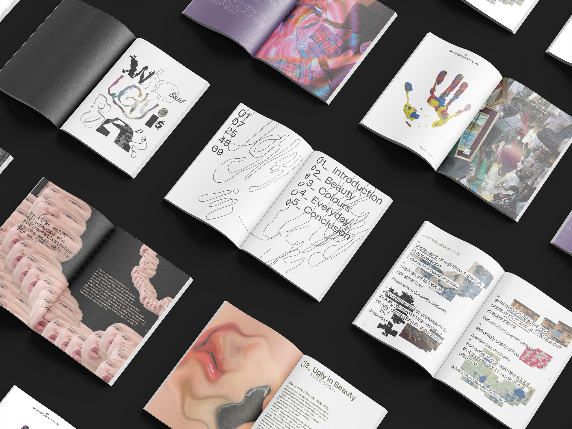
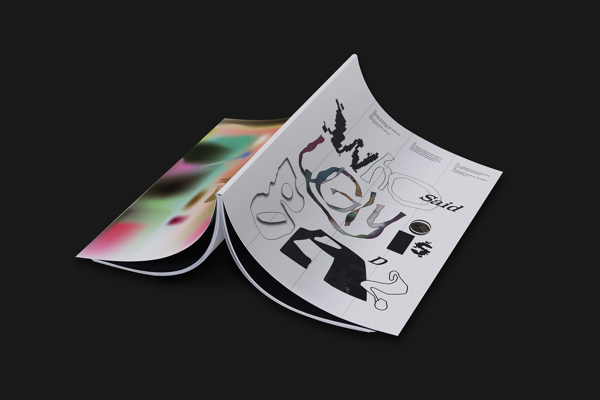
Hello, I’m SoYun Yoon, a third-year student studying graphic design. Personally, I highly value positivity, organization, and curiosity! These three principles have been my primary assets in tackling design challenges. As I approach the completion of my bachelor’s degree, I would like to present my final major project titled “Who said ugly is bad?” At the project’s outset, I focused on the stimulus word I selected, “Ugly,” which is undeniably an intriguing term. This word emerged during a valuable activity that marked the beginning of my final major project. Ugly is commonly understood as meaning unattractive, unpleasant, or the opposite of pretty. This led me to ponder its underlying significance.
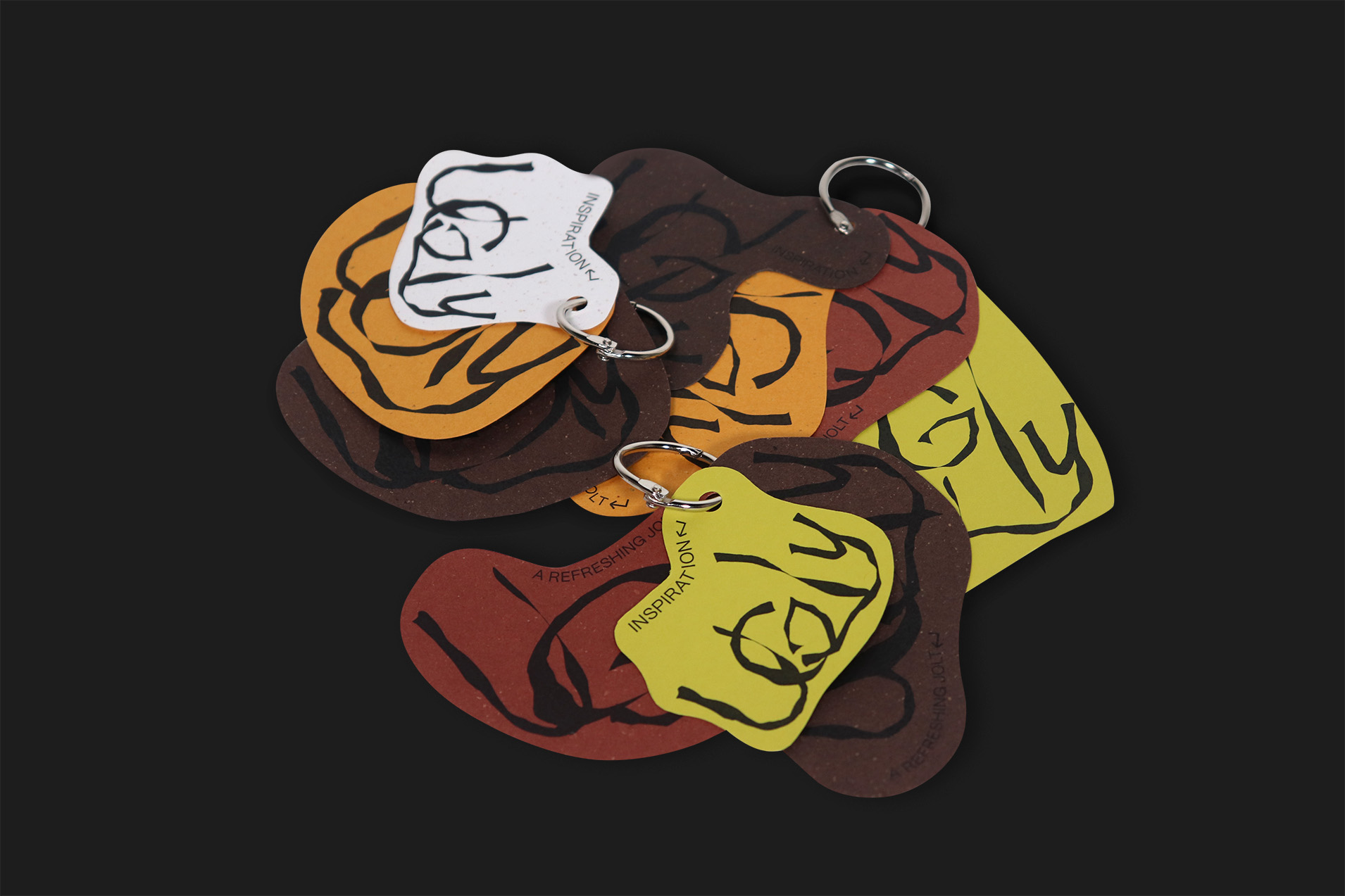
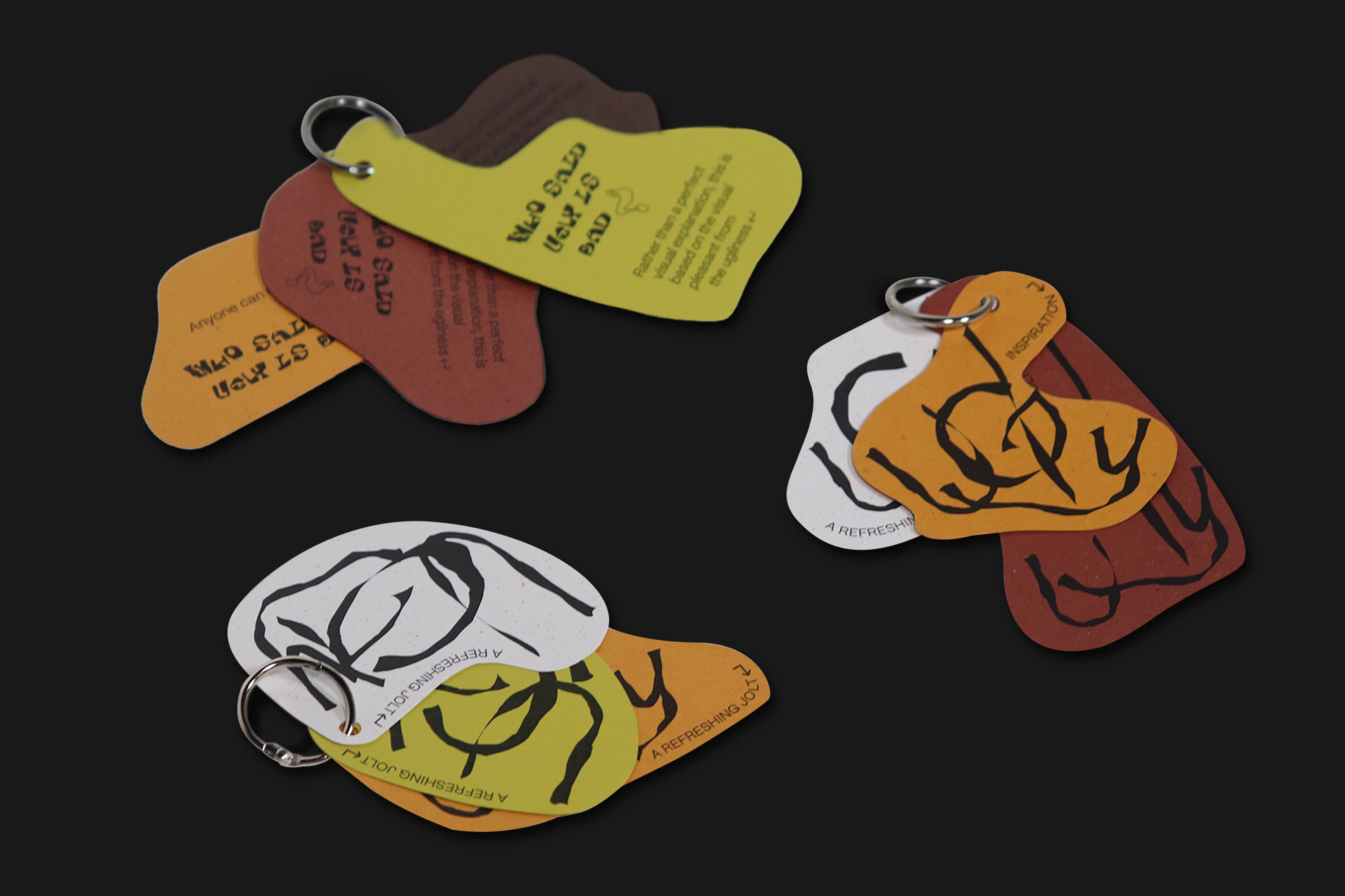
This train of thought sparked my inspiration, as I sought to empathize with the concept of ugliness and explore how imperfection harbours inherent beauty. The process of selecting stimulus words served as my initial muse, prompting me to delve into the meaning of ugliness. What is the obscured meaning of ugly within its lexical context? This question became my focal point. I delved into research on the “Pretty ugly” trend in fashion, design, and history to gain a deeper understanding of how “Ugly” fits into my ideas. My surroundings, experiences, childhood memories, and photographs greatly influenced the use of imagery in my work. For instance, the first ugly image I chose is a childish drawing I crafted at the age of five, which continues to resonate with me as a design element that challenges the stereotypes ingrained in my creative process.
Likewise, through this “Ugly book,” I aspire to influence my audience, inspiring them to explore their own notions of ugliness, even if they are seemingly unnecessary.

