Hi I am Bex and these are my projects for my FMP.
As a dyslexic, there are times when I find designs and aspects of society inaccessible. This is frustrating as dyslexia is well known, and yet there are still barriers in society I face because of this. Reflecting on this made me realise what it could be like for those with other disabilities. I want to help to better the design world and make it more accessible and human-focused. Because of this, I am always wanting to learn more as I am inspired by how people find ways to adapt and create. For my FMP I focused on Accessible Design, and what that means to different groups in society. As well as who is affected by it, and how it can be used to benefit everybody. Because of this, my project split into two areas.
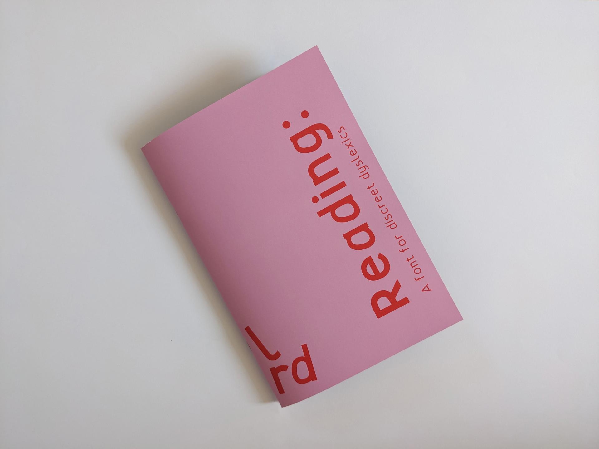
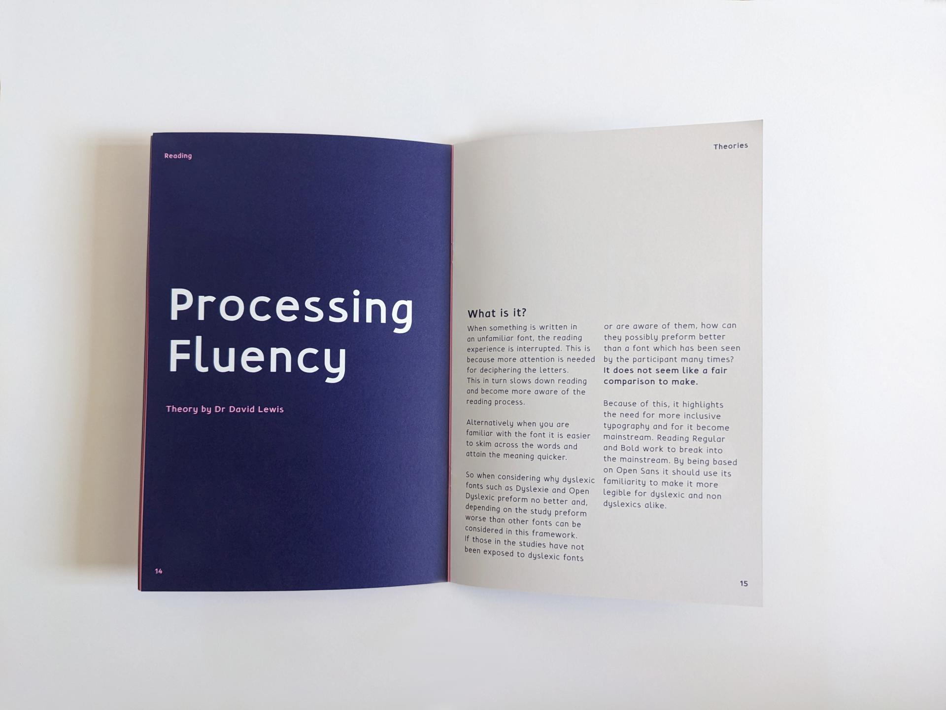
The first area was focused on dyslexia, and creating a typeface that could make the reading process easier, but also be discreet. I targeted “discreet dyslexics” which are people who think they may be dyslexic, or have mild dyslexia that struggle without complaint due to fear of stigmatisation. This font is to appear discreet, with unique, defined features which make it easier for those with dyslexia to read. Whilst pairing it with a simple sans serif design to disguise it as a regular font. With the idea of subverting any stigma and allowing an easier reading experience. My research and designs have been distilled down into my font booklet.
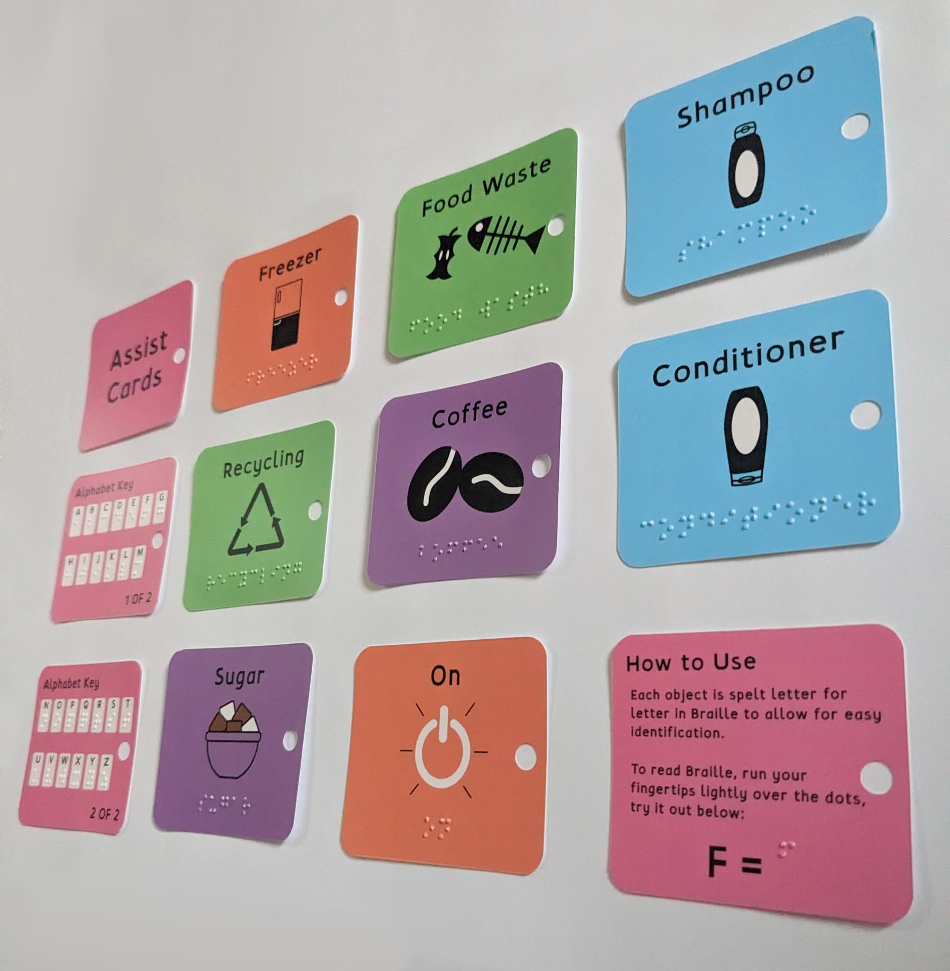
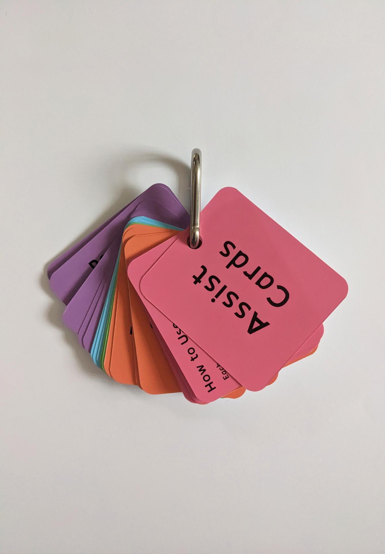
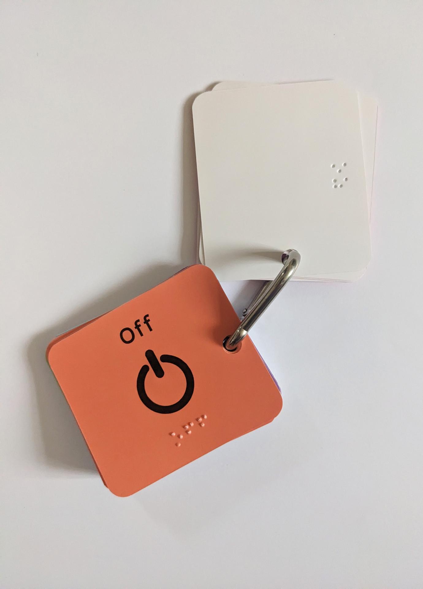
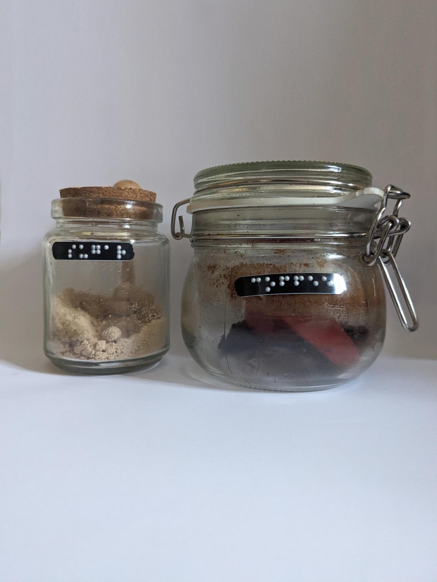
The second area speculated around sight loss with age, and how as a society we accept this, but do not try to help people adapt to retain a level of autonomy. With sight loss and age comes exclusion from the outside world. Meaning homes are even more important to those with low vision. But even homes can become challenging to navigate when sight is worsening. Because of this, I have created Grade 1 Braille cards for household objects such as bleach, shampoo etc with the intention of these being introduced as eyesight worsens. I decided that having words would meet human attitudes of not learning more than what is needed, similar to learning another language where words or phrases are learnt, instead of individual letters. These are then paired with black Braille labels for objects so that users can place them where it would make most sense to them, as well as creating high contrast between labels and objects. For ease these have been placed on a carabiner so that they can be clipped onto blet loops or bags so that they can be referred to when being used at home. The carabiner also means they can be reorganised to the users’ preference.

