From brand identities and spatial design to editorial expression, my interests are varied and my design practice follows a minimalistic yet experimental style. I often take influence from modular and variable type and work in diverse formats, may it be digital, analogue or a combination of both.
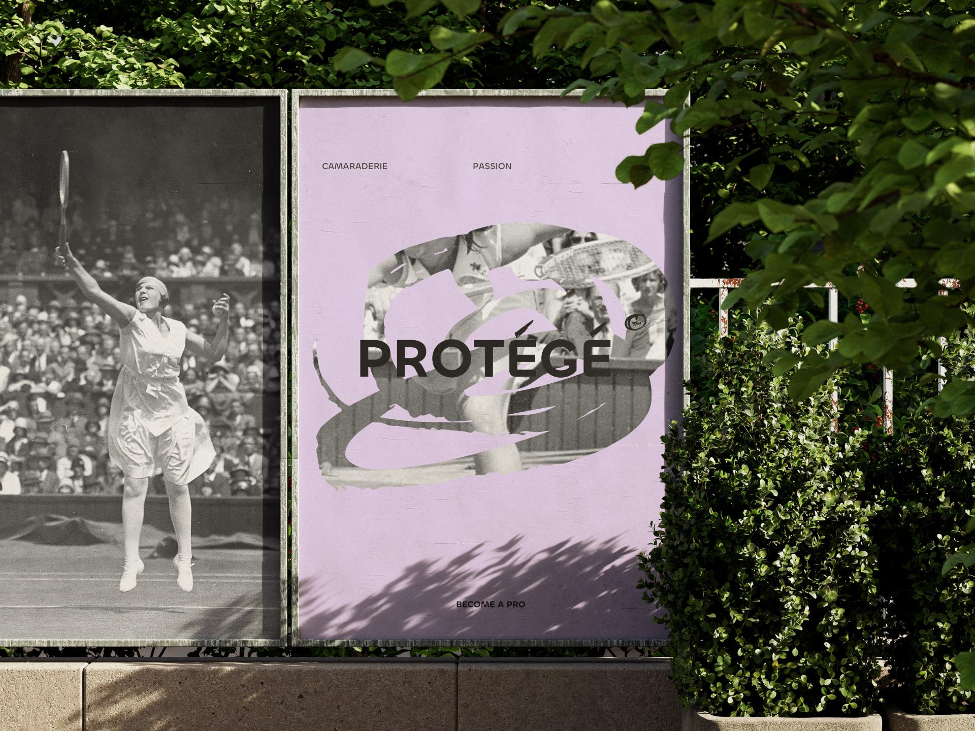
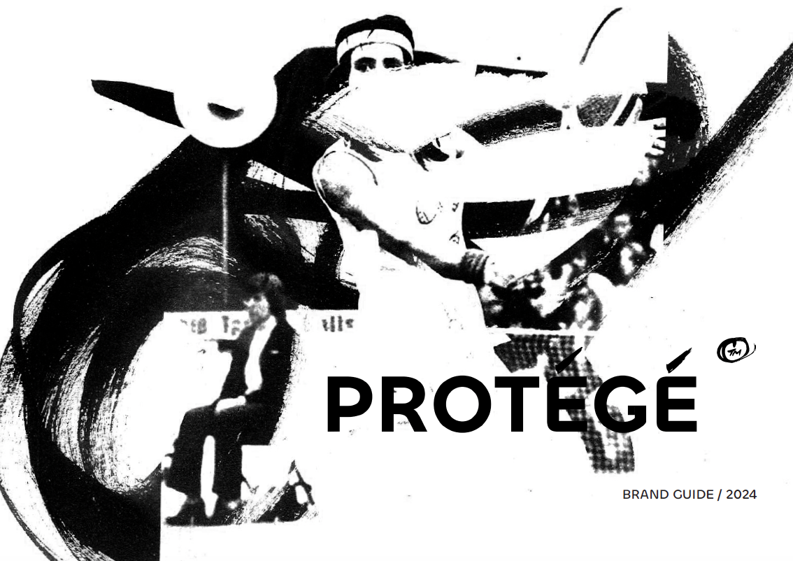
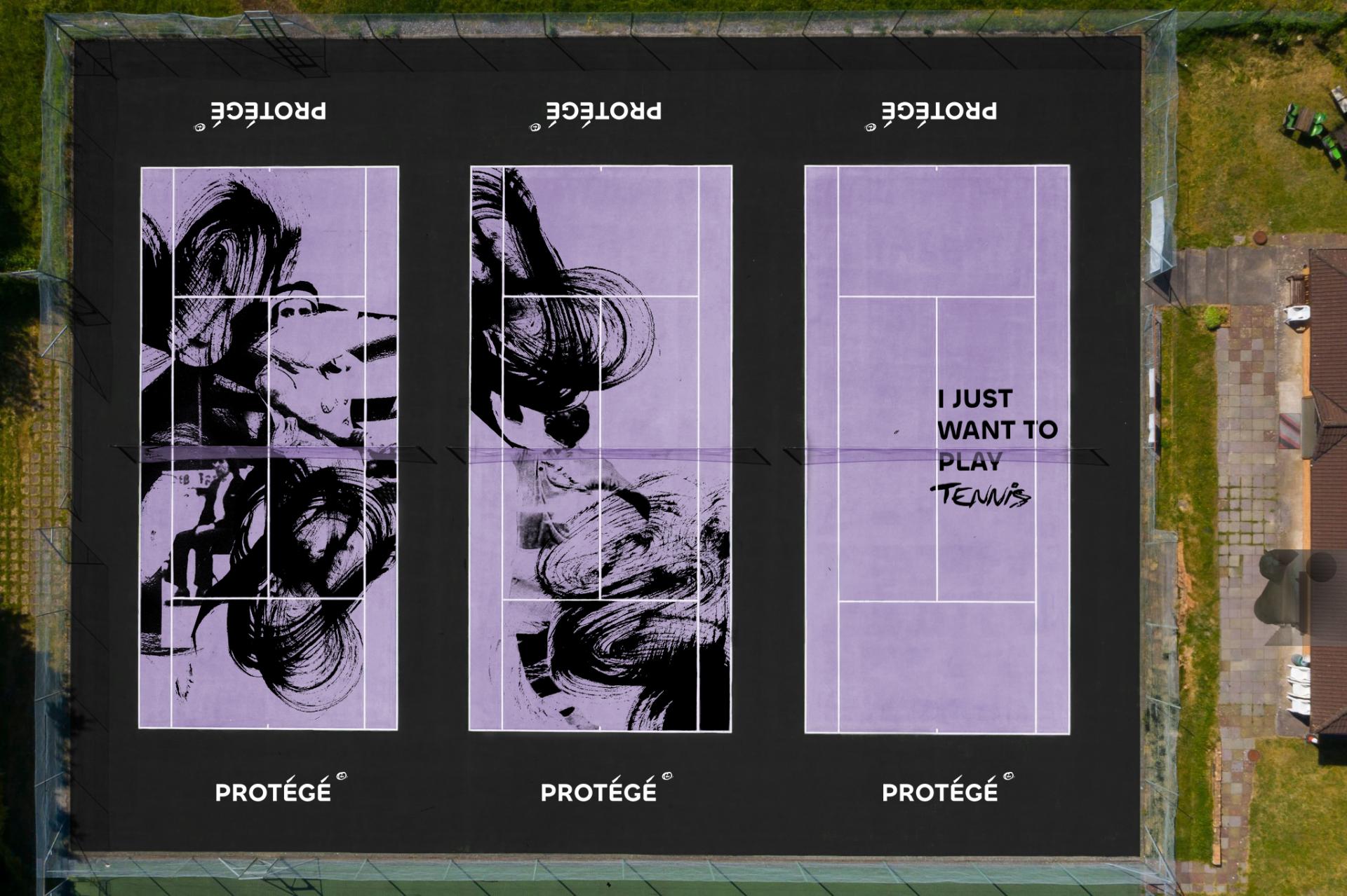
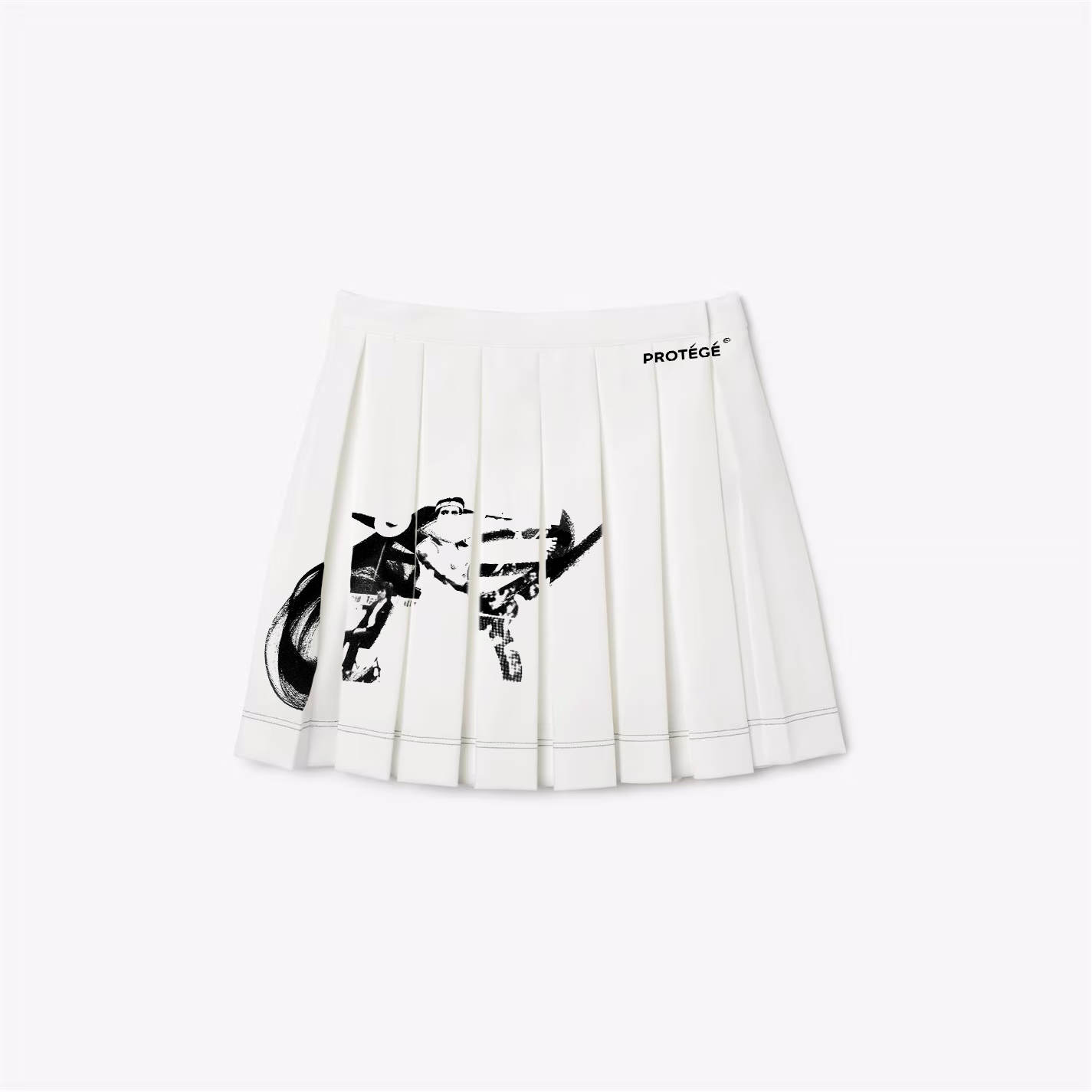
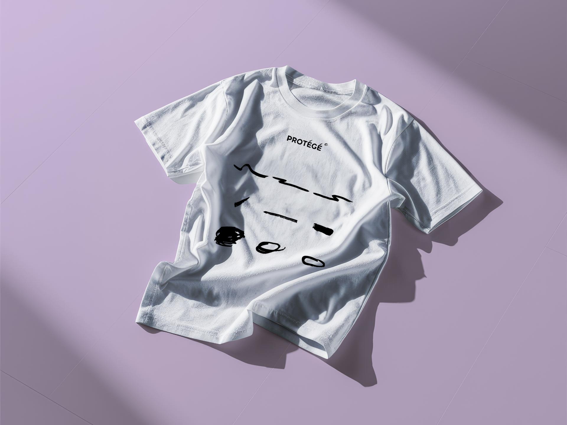
My magnum opus dives into the rich history of tennis and responds to its elitist perception with an alternative tennis club – Protégé. The name of the brand is used to describe someone trained by a person of great experience or prominence. As is implied, the club sees potential in every aspiring player and aims to strengthen interest in playing tennis in the United Kingdom.
Swerving away from tennis whites, strawberries and cream, the brand promotes inclusivity, sportsmanship, diversity and greatness. It pays homage to players whose victories have evoked changes beyond tennis lawns and invites everyone to experience the best of tennis.