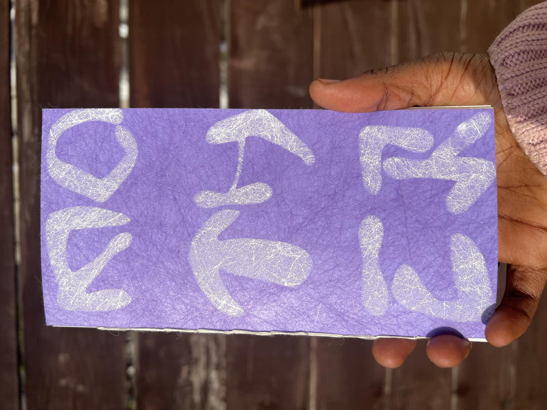
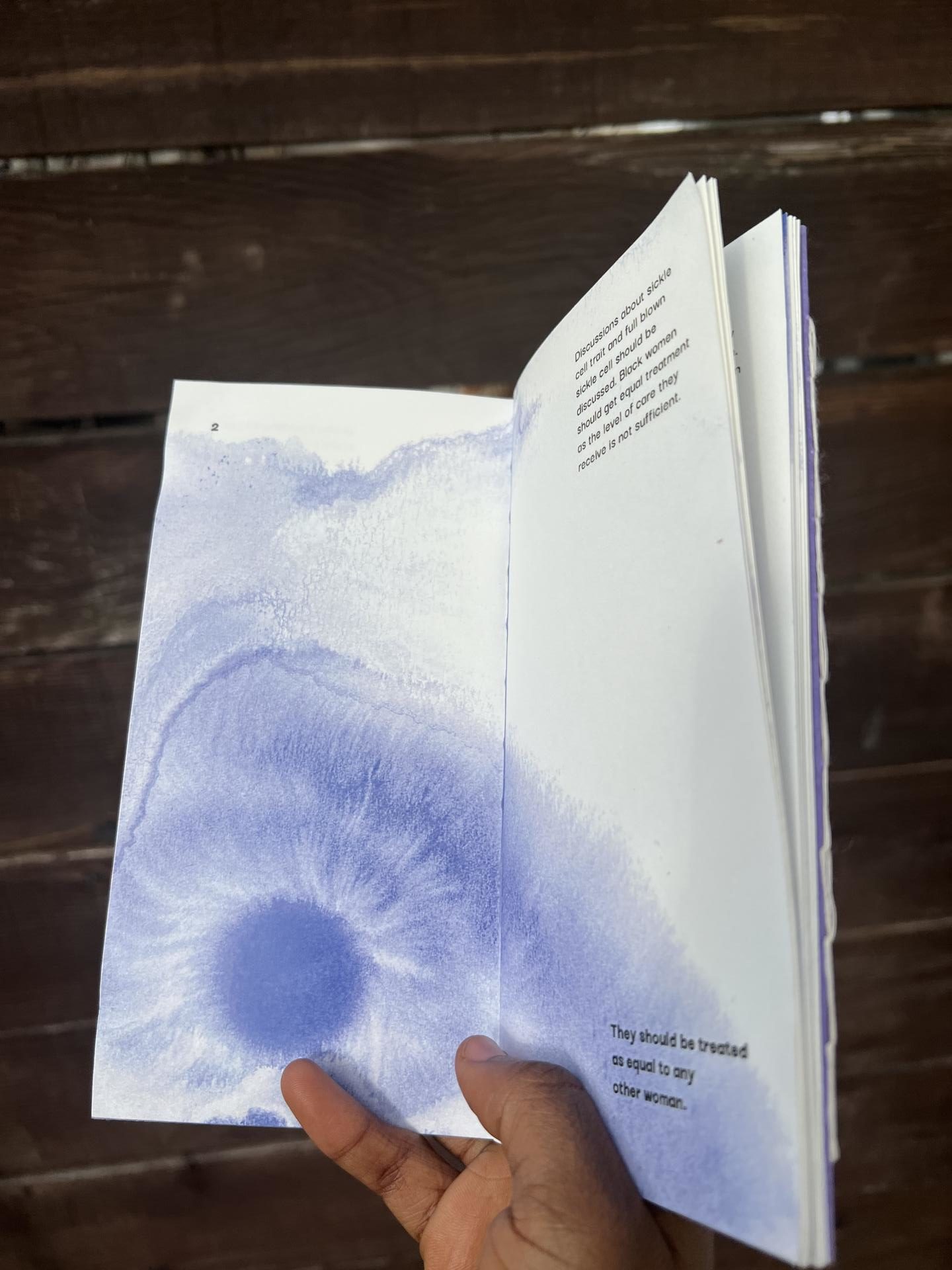
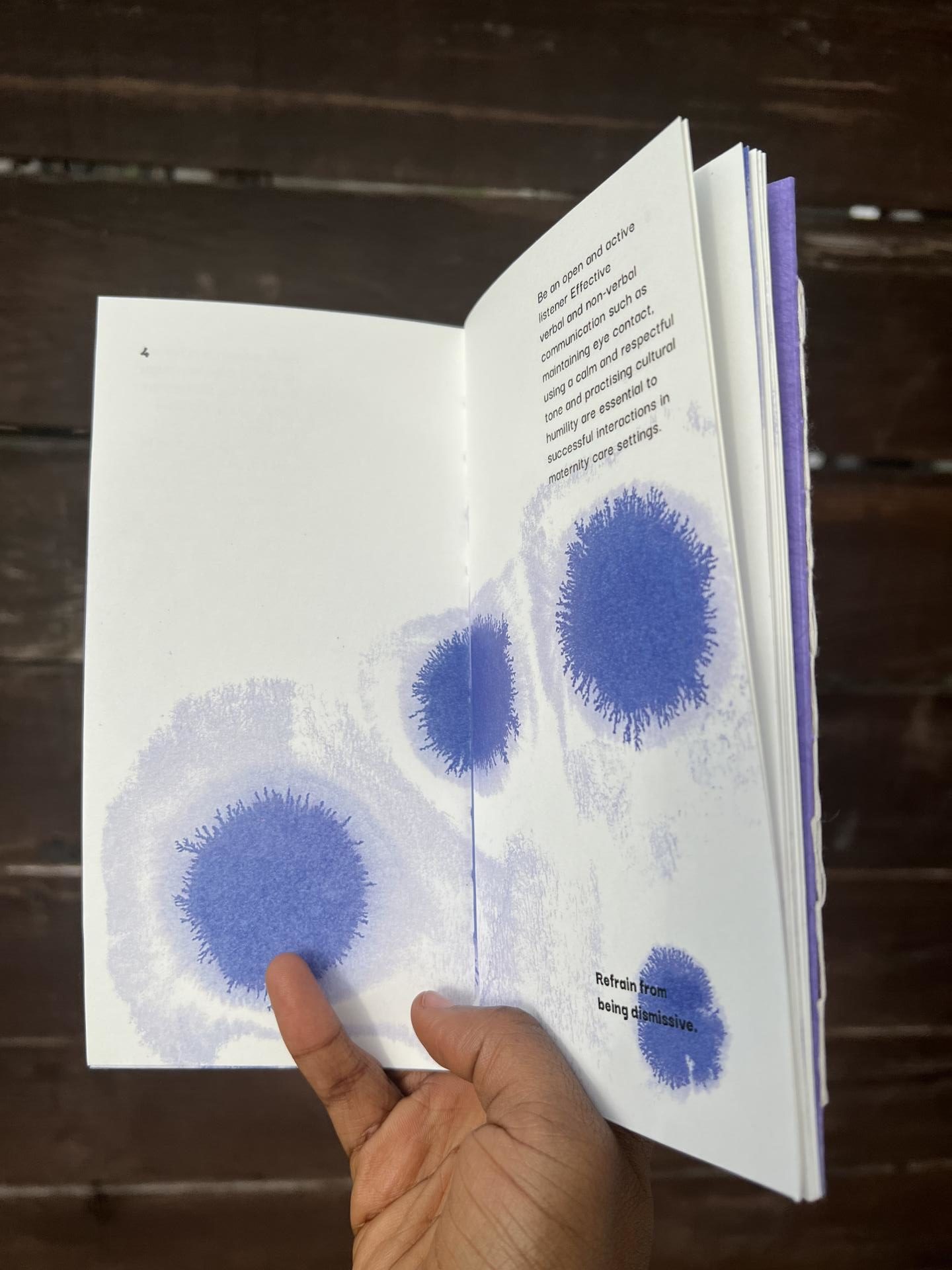
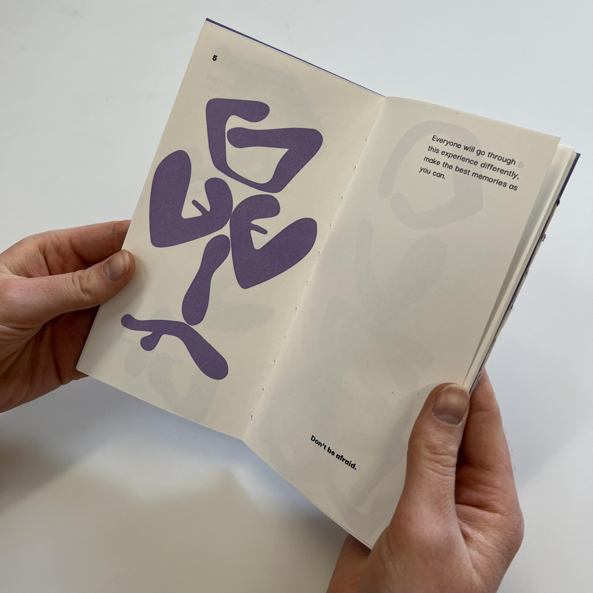
Who I am stems from wanting to showcase unseen and unheard voices as well as vulnerable communities through my creative practice and design work. It is heavily important for me to implement culture, community and bonding into design as one of my final projects highlighted the black maternal care crisis in the UK. Through this project I hoped to introduce more care into the space of black maternal care by producing a leaflet called MOTHER/DOCTOR that showcased two different perspectives; one perceptive being directed to black mothers and the other to healthcare professionals with the use of back to back binding. The leaflet features two different visual languages, the first being a typeface I produced by observing the cradling action which was the epitome of protection and love between mother and baby. I showcased this typeface in the MOTHER section of the leaflet by creating imagery with the typeface that expressed human forms. The other visual language highlighted a more abstract tone where I utilised ink and water forms to create the visual of cells under a microscope as if to express looking at the issue at a cellular level. While these two sections have different tones, I wanted to showcase how they still exist in the same space as the project was really about centring black mothers and their issues in the healthcare system as well as highlighting the need for more care and support for vulnerable women. All the information sourced into the leaflet was obtained through multiple interviews and questionnaires. to see more of my work, please visit my Instagram @designsby_b.k or email me at [email protected]. Thank you!
Bolu Kolawole
Graphic Design
Theme
Share
@designsby_b.k
